In both cases I created an extra layer to make these edits in so as not to destroy the original image.
beelzebub has a devil set aside for me
Friday, 22 February 2013
Converting to black and white in photoshop
Thursday, 21 February 2013
Monday, 11 February 2013
Architectural Photography
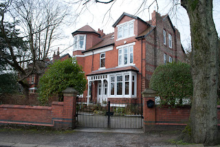
 These shots were all taken on Darley Avenue in Didsbury and on the banks of the Mersey, which flows in between Darley Avenue and the golf course behind it. Historically, the area has significance in that Prince Rupert stationed himself nearby during the English Civil War and that Bonnie Prince Charlie likely crossed the Mersey in the area in 1745. [x] The architecture in the shots, however, looks to be Victorian. The area is still quite gentrified, with many gates outside houses being kept locked with buzzer systems.
Thursday, 22 November 2012
External Location Project
 For this project, I used a Nikon D3000, a Nikon 18-55mm 1:3.5-5.6 lens and a UV filter.
 The final theme and set of photographs shown here evolved from several different ideas. My initial plan for the location project was to take photographs of people's pets in Alexandra Park in Oldham. Unfortunately, this plan fell at the first hurdle - the weather was set to be miserable and as winter marches on, the days are getting shorter and it is harder for me to find a few hours of daylight outside work. I also live quite a way away from Alexandra Park and had to plan my shoot around when my mum was going to be taking our dog there for a walk in order to get a lift there. Consequently, my shoot ended up being on a weekday around early evening, when the light wasn't exactly spectacular and the only pet around besides my own was a single Yorkie, who was far too excitable to get a good picture of. I considered revising my plan to pictures of animals found in a park, but my dog scared the waterfowl and squirrels away. So, finally, the plan was revised to simply scenes from a public park. The shots of the squirrels are from a park near the college, and the rest are from Alexandra Park.
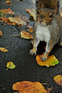
The squirrels were surprisingly easy to photograph - they seemed quite comfortable around people and fascinated by the camera, willingly coming towards me, especially when tempted by biscuit crumbs. I am particularly proud of the second squirrel shot, as it has an interesting angle, the suirrel neatly fills one quarter of the photograph, and because of the short depth of field used (F5.6), the detail of the squirrel's fur is in focus while the leaves directly in front and beside it are blurred.
The photo on the right is of my own pet dog - I wanted to try a portrait style photograph with a short depth of field, but as dogs often are, he was not very biddable and I had to make do with the shot on the right. Nevertheless, I am quite pleased with the composition of the photograph, such as the way my dog is right in the centre of the shot.
In the absence of more animals to photograph, I turned my attention to the scenery. It was getting darker at this point, so I compensated by changing the shutter speeds - they vary from photo to photo (1/80s in some, 1/13s in others). As is evident by my selection of shots, I became somewhat enamoured by the padlocks and took lots of short-depth-of-field shots of them. My favourite is the one on the left, because the padlock is upright and in focus, with the cobwebs and the texture of the metal in detail, with the background at a near-45° angle because, like a person in a portraits, it is less important than the central feature of the shot. I also feel that the bottom-right photograph of the padlock with the orangey-brown leaves is quite a good shot, because of the lines of the fence in the upper third of the shot, and the autumn-y colours of the leaves contrasting with the grey metal in the foreground.
I also took plenty of shots of the signs in the parks, though due to the difficulty of getting the exposure right in the dull weather and while it was getting dark, only the two below made the cut. I quite like the one of the "public toilets" sign, because of the way the photograph is divided into two halves, and the contrast between the brick wall and the greenery in the distance, though I did have to correct the exposure a little in Photoshop (plus, due to bad time management, the final print of this shot in my portfolio was printed with the slightly darker version from before I corrected it).
I think the shot of the "conservatory gardens" sign is the weakest of the ten, as I feel that the colours are not very striking - the dog doesn't stand out from the soil as well as I'd like - but I still like the composition.
Overall, I feel that while I produced some shots I like, there are some quite weak shots dragging the overall project down. I could also have managed my time better and planned more thoroughly - if I were to do this project again, I would have included more shots of greenery (and obtained a tripod for this) and gone at an earlier time of day to increase my chances of getting some shots of people enjoying the park and out with their dogs, so that overall the project would have tied together better and more effectively given the impression of a public park. As it stands, I probably chose far too many shots of padlocks and not nearly enough of greenery for a landscape photography project.
Friday, 9 November 2012
Photoshop: Montage

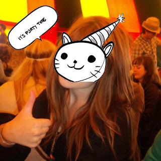
Some very basic photoshopped photo montages of my friends as some of their favourite cartoon characters.
Friday, 19 October 2012
These two shots are of the same scene, but one is shot with an 18mm focal length and the other with the 55mm focal length. i think the 18mm works best in this case - in the 55mm, the most interesting feature of the pictures (the squirrel) is in more detail, but in the 18mm, the shot is composed better. The rule if thirds, for example, is obeyed in the 18mm shot - the greenery in the top third of the shot helps to break the monotony of the brown leaves. the lack of this in the 55mm shot makes it a boring and not very well-composed shot.
Subscribe to:
Comments (Atom)


